A Visual History of Patent Protection
I noticed that most articles in economic journals avoid to visualize the scores of patent rights indexes. But doing so is quite helpful to understand how patentability, compulsory licensing and patent terms have changed over time.
The following graphs are based on the widely used patent rights index by Park and colleagues. This index is available for 122 countries over 55 years and consist of five main categories:
- coverage +
- membership +
- loss of rights +
- duration +
- enforcement
Coverage
A country has high coverage, according to the index, if it grants patents for formerly unpatentable „technologies“:
- pharmaceuticals,
- chemicals,
- food,
- plant and animal varieties,
- surgical products,
- microorganisms, and
- utility models (somewhat problematic)
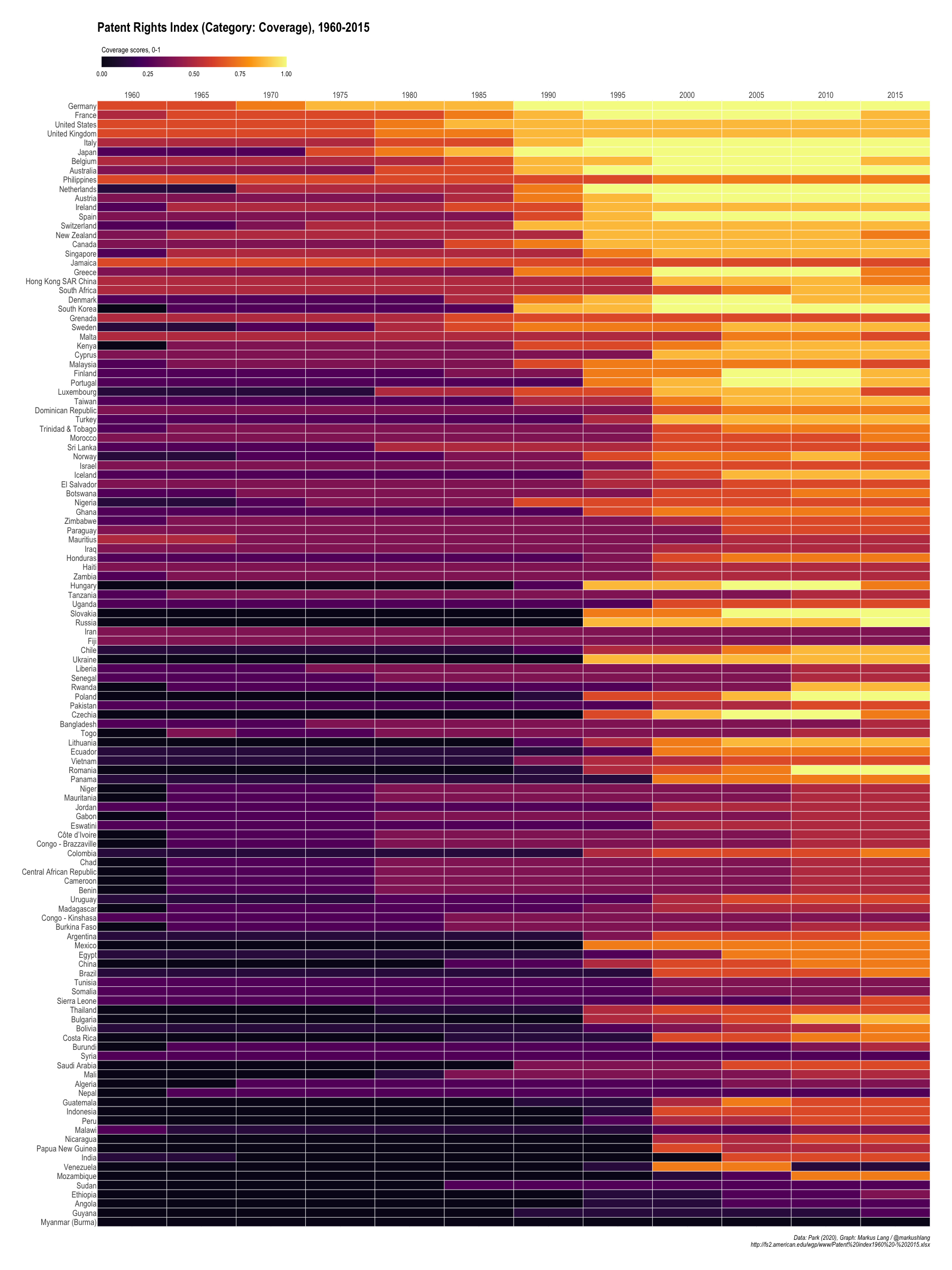
Patent Rights Index (Category: Coverage), 1960-2015
Membership
Park and colleagues assume that membership in the following international agreements generally equals higher protection:
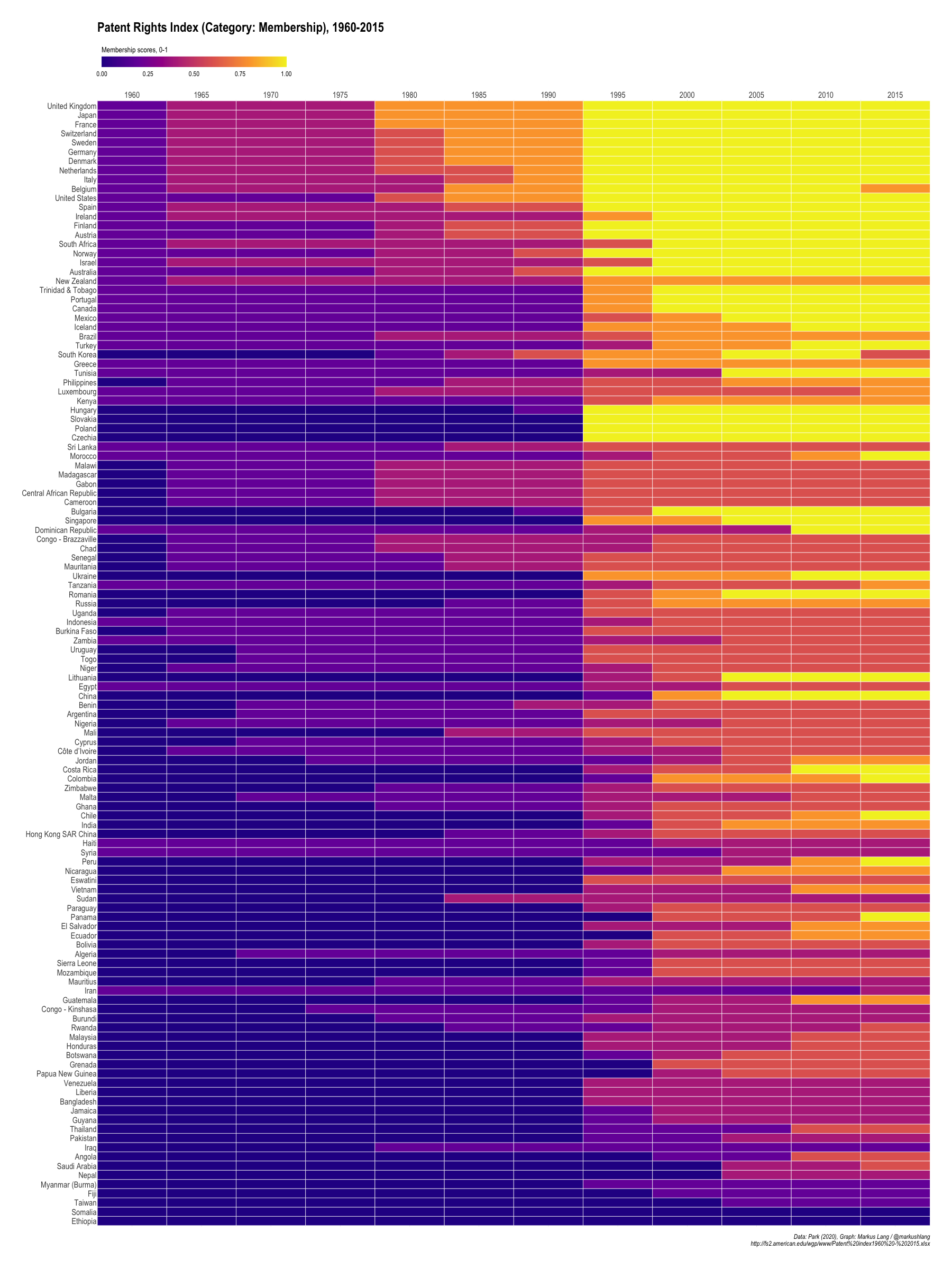
Patent Rights Index (Category: Membership), 1960-2015
Loss of Rights
An additional assumption of the index is that countries without (!) the following provisions provide higher protection to patent owners:
- working requirements
- compulsory licensing requirements
- straightout revocation
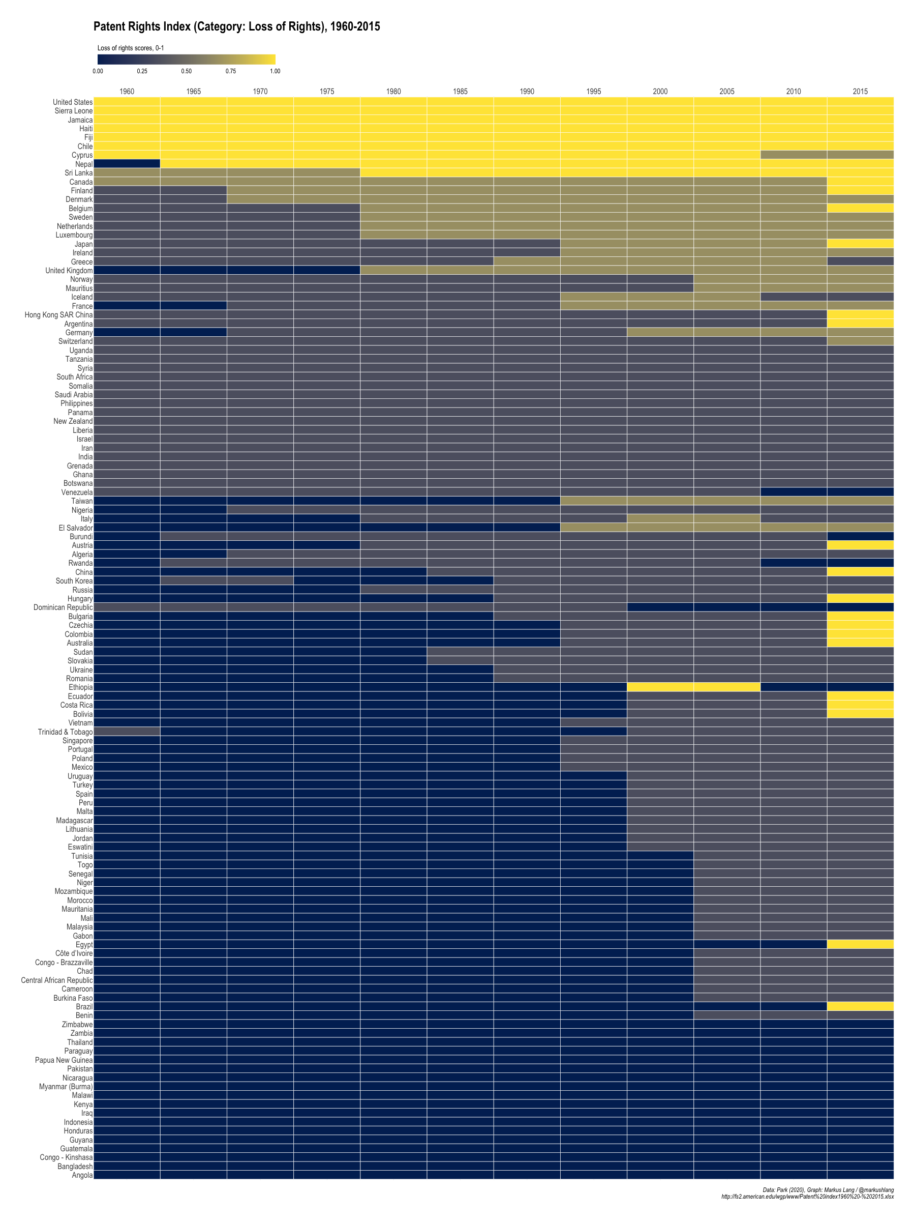
Patent Rights Index (Category: Loss of Rights), 1960-2015
Patent Term
To determine whether the patent term in a given country is long or short, the index compares available years to the “appropriate maximal term of protection”. If a country allows 15 years of protection, but could have allowed 20, it receives a score of 0.75 (15 years/20 years).
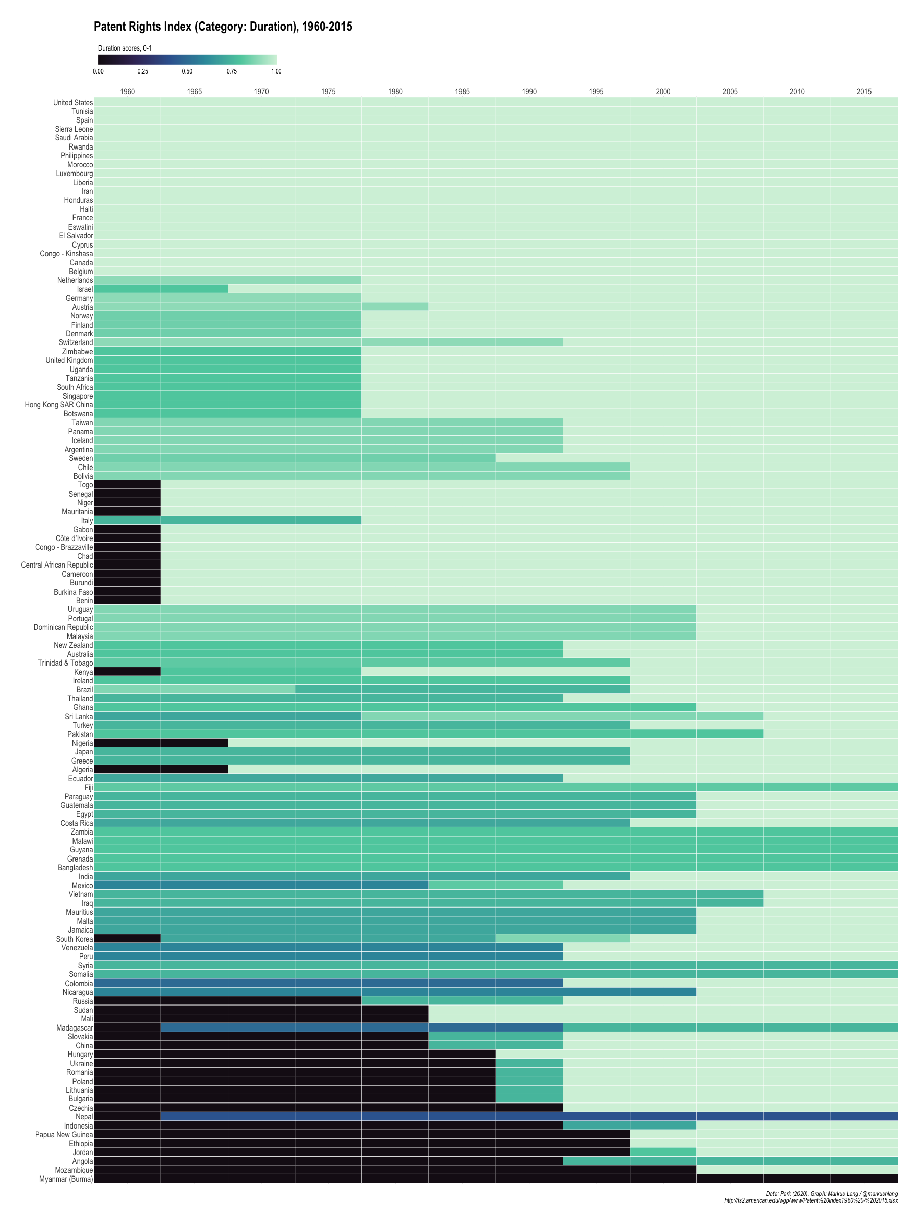
Patent Rights Index (Category: Duration), 1960-2015
Enforcement
Does country x make the following enforcement mechanisms available to patent owners?
- preliminary injunctions
- contributory infringements
- burden-of-proof reversals
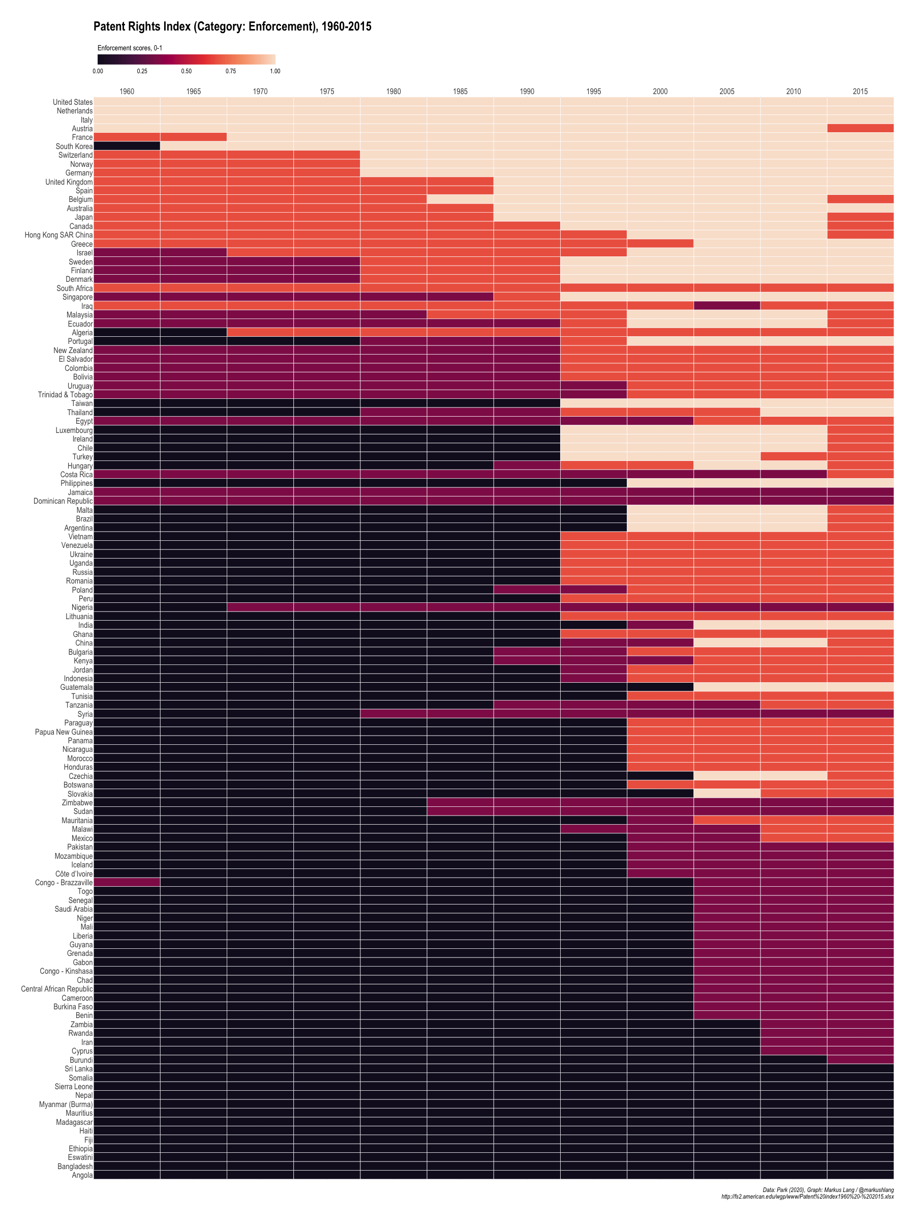
Patent Rights Index (Category: Enforcement), 1960-2015
Overall
The final index just sums up the scores across all five categories to get overall scores for each country.
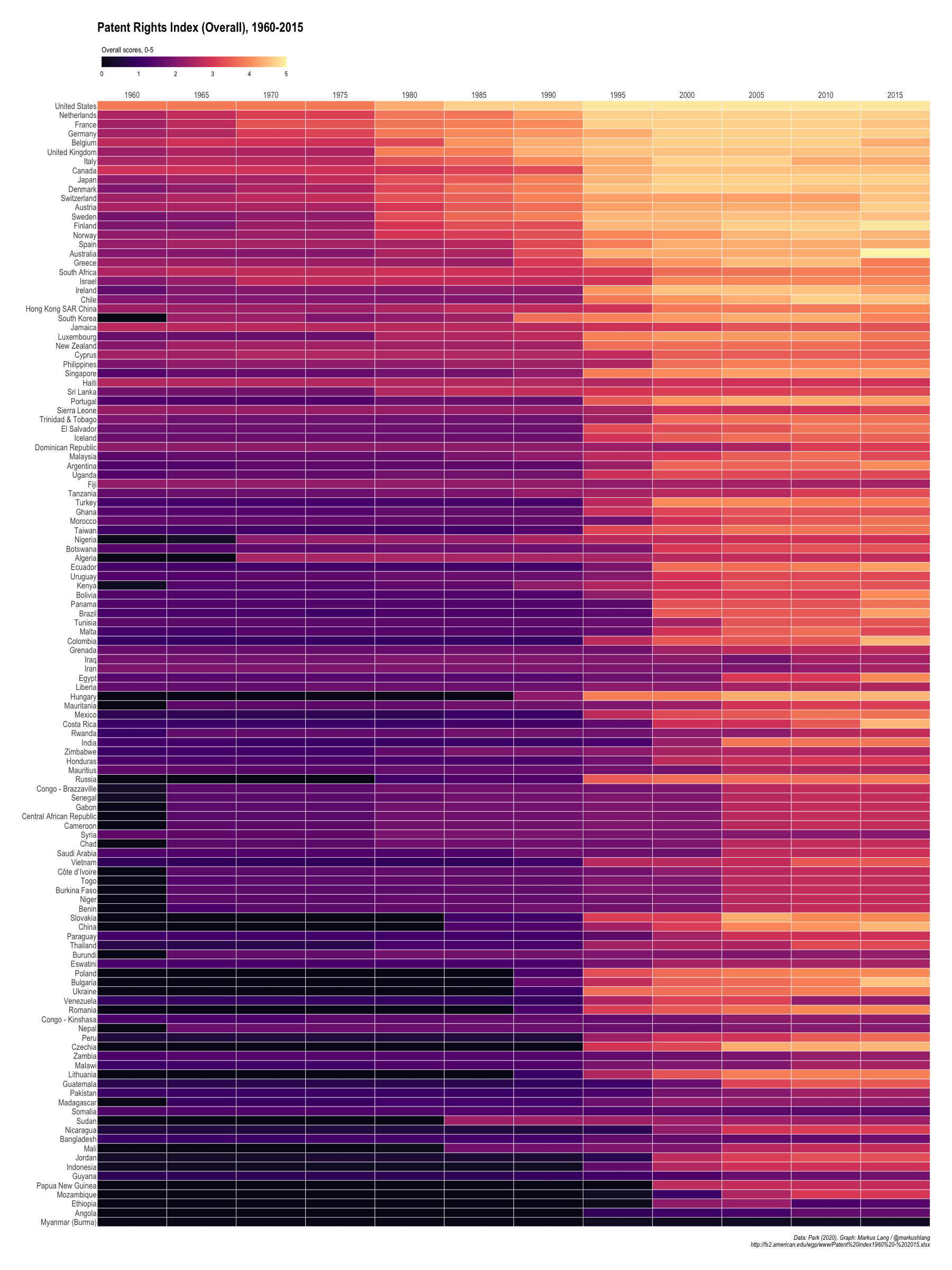
Patent Rights Index (Overall), 1960-2015
Yearly Averages
Heatmaps are helpful to explore timeseries of individual countries over time. To be able to spot more general trends, I have also plotted yearly averages.
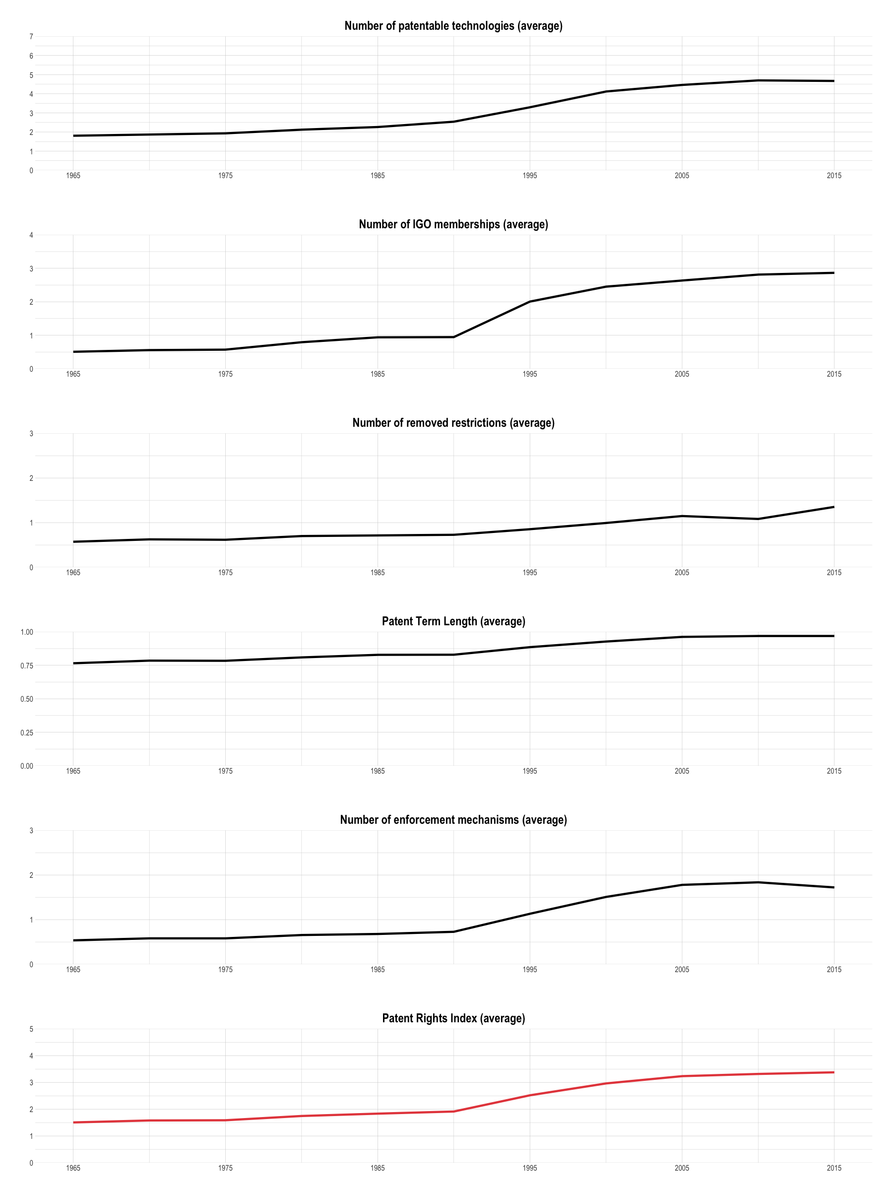
Patent Rights Index (Cross-Country Averages)
Code
Code (+data) is available here: https://github.com/markushlang/patent_rights_index
2020
El Greco color palette for R
I have created a small R package with color palettes from El Greco paintings. It’s available on Github: https://github.com/markushlang/elgreco

AndrewFrancis1

Shepherds1
Spanish Flu Datasets
I have bundled a few datasets mentioned in Alfred W. Crosby’s (2003) book “America’s Forgotten Pandemic” into an R package. In addition to Crosby’s data, I have also added data on non-pharmaceutical interventions by larger U.S. cities during the 1918 and 1919 outbreak from Howard Markel and colleagues.
The spanishflu package can be used to create figures similar to current COVID-19 figures.
This is a small example on how to do that:
| |

Selected U.S. Cities